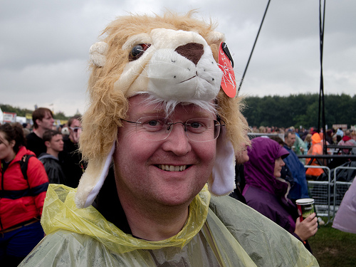
Experimenting with themes again

Photo by Mupwangle

As you’ve probably noticed, I’m buggering about with themes again in an attempt to make the site a bit cleaner-looking. What do you make of this one, folks?

The theme gives me a few options to make the text look nicer, including intro paragraphs (above) and some very pretty blockquote formatting:

“Before you criticize someone, you should walk a mile in their shoes. That way, when you criticize them, you’re a mile away and you have their shoes.”
— Jack Handey

Posted

in

by

Comments

0 responses to “Experimenting with themes again”

  1. Testing, testing, 1, 2, 3.

  2. You could do without the graphics round the blockquotes. Way too many lines

  3. Hunnymonster

    As I mentioned on twitter – that’s some syrup in that picture. Are you the secret lovechild of Bruce Forsyth?

  4. gary

    I thought maybe left-justify the post titles too. Reckon?

  5. Hmmm. Not sure. There’s an awful lot that’s centred

  6. mupwangle

    It’s all a bit cream, isn’t it?

  7. Gary

    Would you prefer black for the post titles and blue links?

  8. hunnymonster

    Something a bit less stark on the background and commensurately darker text for me… as it is this is giving me a sun tan.

  9. I think this is all very nice considered as a work of art: stand back and it looks nice. Actually reading it is a pain in the arse, I’m finding. Way too many different formats, too much centring; a single post is broken up too much — the reading doesn’t flow at all.

    The intro paragraph could be done well, I suppose, but the current formatting has lots in common with the blockquote formatting and nothing in common with the main text: look at this particular post and it looks like the first paragraph and the Handey quote are part of the same thing, broken up by some little bit of unrelated inconsequential stuff. Intro paragraph should be the same as a standard paragraph only a little bit different, not so different it doesn’t appear to be part of the same text.

    Come to think of it, quotes shouldn’t be twice the size of the rest of the text. That might suit one of those bloggers who never writes anything of their own other than “Read this:” and “So true”, but if you’re going to intersperse lots of quotes with your own commentary — as you often do — this is going to look ridiculous.

    Recent comments at the bottom of the page is wrong, too: people check that to keep up with ongoing conversations, so will come to the site having already read all the recent posts just to look at the comment feed: it needs to be at the top.

    As ever, feel free to disagree with me. I assume you picked this theme because you can see it’s redeeming features. I hate it.

    And there’s some script auto-scrolling the comment input box to where the programmer thinks it should be. Which makes me want to find the programmer and burn him.

  10. mupwangle

    >>I think this is all very nice considered as a work of art: stand back and it looks nice. Actually reading it is a pain in the arse, I’m finding.

    The man is right. It looks pretty but it’s much harder to read than the old one. I liked the old one. I also fear change.

    One particular gripe – on my PC at least there is very little contrast between the background and the comment fields which makes it hard to read.

    Did I mention that I liked the old one?

  11. Gary

    Oh well.

  12. May I ask why you want the site cleaner looking in the first place? This is already pretty damn clean. If someone told you this layout is crappy in some way, they were lying.

  13. Gary

    I’m just fed up :)

  14. Hunnymonster

    To make it more interesting (just for you) have you tried reading it wearing a pair of anaglyphic specs? You can excitedly wink alternately to have it change colour too :)