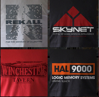
The clothing website Last Exit To Nowhere is based on a simple and brilliant idea: create promotional t-shirts for the products, organisations and places you’ll find in famous films. Fancy a t-shirt plugging the Devil’s Tower from Close Encounters, The Overlook Hotel from The Shining or OCP from Robocop? You know where to go. If I had the cash I’d buy half their product range.
Inevitably it’s been copied, sometimes reasonably well – Insert Coin Clothing takes the same idea and applies it to videogames with occasionally great results – but usually badly. There are countless Last Exit imitators now, and most of their stuff is pretty shoddy.
What Last Exit To Nowhere gets, and what its imitators often don’t get, is that the idea is just the beginning. The execution is just as important. The wrong kind of logo, the wrong colours, the wrong positioning or the wrong typeface can kill even a good idea, and many of the imitators’ ideas are not good.
I thought of Last Exit today when Get Around Glasgow followed me on Twitter. Quite a lot of firms follow people in the hope that you’ll visit their site, and I’m assuming this is no exception. I visited the site and thought: what a great idea. And I thought: what a terrible way to execute it.
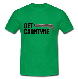
The idea is basically Last Exit, but for Glasgow instead of films. If it were done as well as Last Exit, if its graphic design was to the same standard, if it had more thought behind it and didn’t just make bad puns (“Get Carntyne” doesn’t even make sense. Get Cowan, with a picture of Tam Cowan, would at least raise a smile) but actually gave Glaswegian firms, characters and landmarks the Last Exit treatment, then that really would be something.
Anniesland Cross treated like Miami Beach? Fifties-style graphics for The Blue Lagoon chippy chain? Promos from a world where Glasgow Zoo wasn’t appalling and didn’t close? Count me in.


