When you’re bouncing a baby around your mind tends to wander, and today was no exception: I found myself staring at the bookcase, which contains far too many crime novels, decoding the visual grammar of the cover designs. I don’t know if there are similar rules to other genres, but there’s definitely a set of rules that apply to crime novels.
Here’s how they work.
The colour scheme
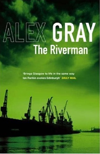
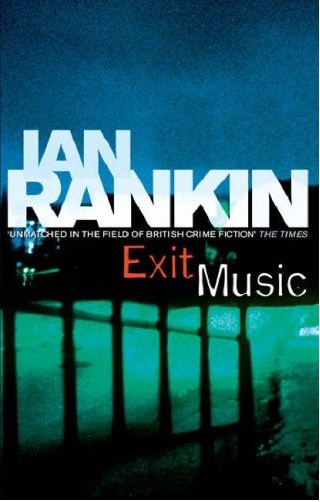
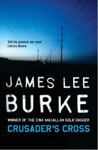
The background must be black or white, and feature a photograph of something normal – some trees, a tenement window, a back street. The photograph should then be treated to make the normal look spooky, so for example if it’s a picture of Glasgow’s Clyde Auditorium (the Armadillo) then it should be enhanced so the sky is in shades of blood-red with the venue in silhouette; if it’s a picture of some trees it should be shot on a really misty morning and desaturated to make it look spooky; if it’s a city street it should be taken with a ridiculously long exposure so car brake lights become a river of red neon; and so on. If you’re a crime novelist and your cover features a bloody knife, bullet holes or the chalk outline of a corpse then your publisher doesn’t see you as a class-A writer; if the cover is largely neon, your publisher sees you as a writer of crime capers rather than serious crime fiction.
The author’s name and title
There’s a simple equation here: if the title is bigger than the writer’s name, you’re a newbie. The more successful you get, the bigger your name becomes and the smaller the title gets. The goal for crime writers is for your name to take up 7/8ths of the cover and for the title to be so small it’s only visible through an electron scanning microscope.
The author’s name
This is another gauge of success. The more you sell, the bigger and bolder your surname becomes. So if you’re just starting out, your name will be printed (in teeny-weeny text) like this:
Gary Marshall
As you sell more books, the surname gets promoted and the text size gets bigger:
Gary MARSHALL
And when you’re doing brilliantly, the surname gets promoted further still while the first name gets demoted:
gary MARSHALL
Ideally the font will be Helvetica or something similar, with your first name using the lightest possible variant and the surname in the heaviest possible variant. If you have that and your surname is printed in a font size ten times bigger than your first name, the next royalty cheque should be a good ‘un.
Special text effects
If your name is printed in shiny foil or with a clear gloss laminate, or you get a gritty typeface, your publisher hopes you’ll be the next Ian Rankin but the sales figures aren’t vaguely close.
“A Chief Inspector Spanky novel”
Your publisher reckons that nobody who reads your stuff can remember who you are, and he or she hopes that putting the main character’s name on the cover will persuade the Tesco shoppers to buy your latest book. This is rarely a sign of confidence.
Are there any rules I’ve missed?